Toyota Product Design
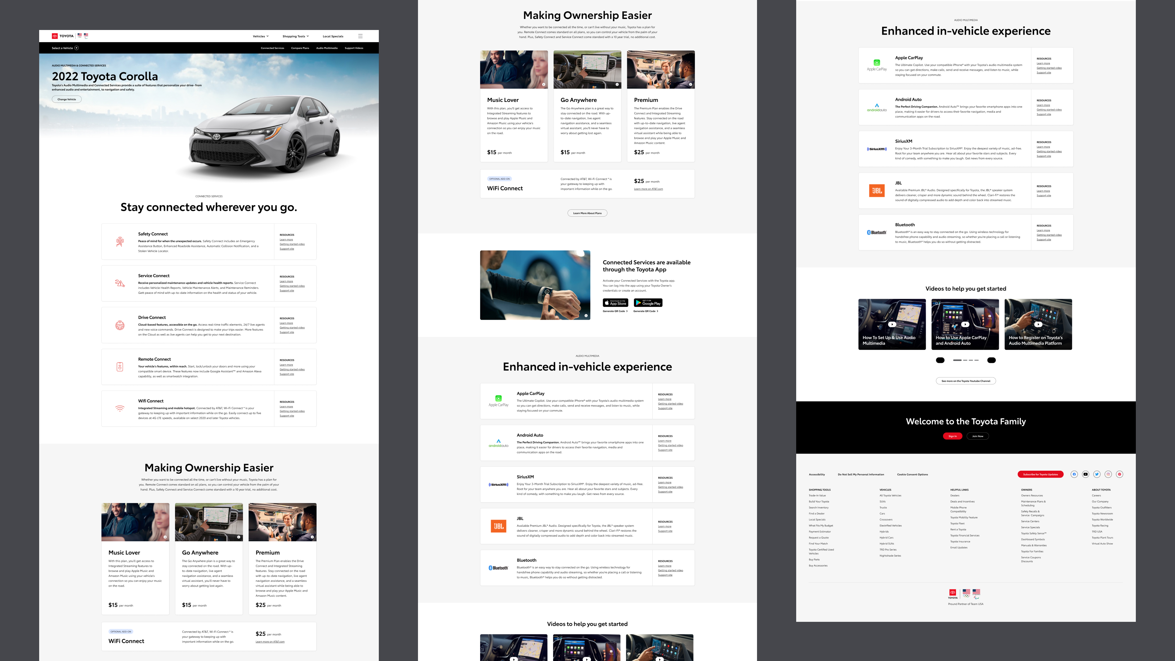
As Senior Product Designer at Saatchi & Saatchi, I worked with a team on the UX and visual design of Toyota.com, primarily focused on the Toyota Digital Redesign initiative. As part of the MyToyota team, I was responsible for creating engaging and useful experiences within the Toyota Owners product. I recently led the redesign of the Audio Multimedia and Connected Services experience within the website, seen below.
Strategy & UX
The Audio Multimedia and Connected Services portion of the Toyota website was a particularly thorny section to tackle. Toyota has an enormous catalogue of vehicles (current and historical) with varying features, and the way information was presented on the site was different between the shopper and owner audiences.
Working with Saatchi & Saatchi's strategy team to understand user behavior through analytics, we learned it would be most effective to consolidate the experience into a consistent flow across all audiences and vehicles.
Below is a sample of the wireframes I created during the UX phase of the project; I also did a comparitive / competitive analysis to understand best practices and opportunities for a competitive advantage.

Easy access to information
A main goal of the project was to help both shoppers and owners get the information they needed quickly. For shoppers, they want to quickly get a sense of what features a vehicle offers; owners want to easily understand how to use the feautres of their car. To this end, we introduced a new feature card component, which includes a brief description with links to resources such as manuals, videos, and FAQs. With this approach, any visitor to the page could get the info they needed right away.

Selling Connected Services
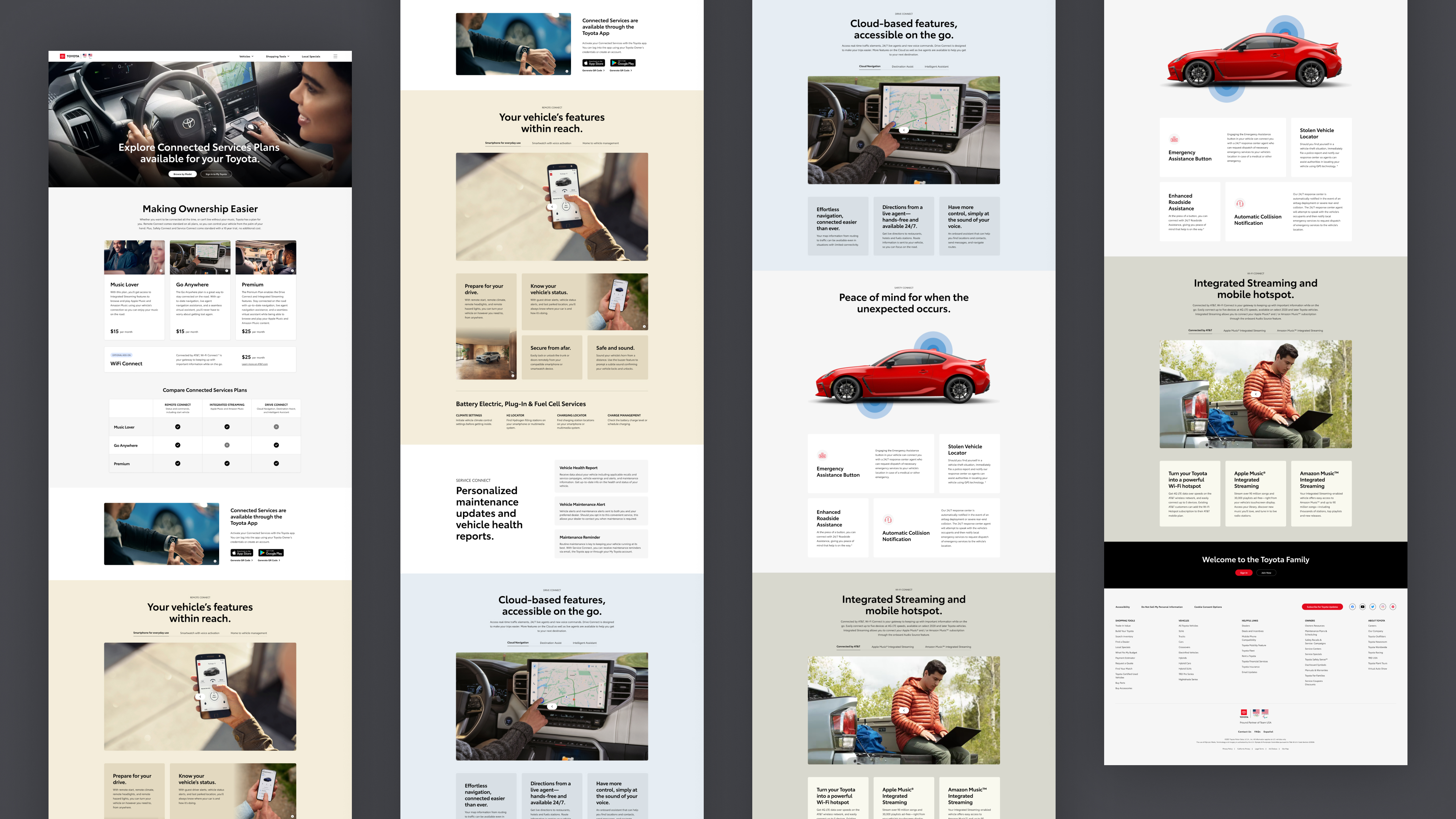
As part of the launch of this redesign, Toyota also introduced new subscription plans for their Connected Services. Because this is an important revenue stream, we wanted to create a more robust marketing page to explain the value of these services to existing and potential customers. The result was a page that featured video content, compelling imagery, and the creation of a new flexible content feature component that is now used throughout the Toyota ecosystem.

A system of reusable components
One of the challenges of the Audio Multimedia and Connected Services information is that the library of related content needed to be easily accessible throughout the site—on owner pages, landing pages, support pages, and more. To meet this challenge, we created a system of reusable modals that could be easily implemented anywhere on the site, or adapted to work for future feature launches.

Everything responsive, componentized, and documented
As part of our delivery to the development team—and to ensure that the work could be used throughout the Toyota ecosystem—every aspect of this design was designed responsively, componentized, and thoroughly annotated. This ensures a good relationship with engineers, and ultimately a better experience for the user.
Credits: This project was done under the creative direction of Logan Miller, with help on documentation and componentization from Ben Dobkin.
Contact Me
I’m currently taking on new clients, and would love to hear about your project. Please include as much information as possible about the scope of your project, your timelines, and your budget.
Email me at hello@owltastic.com